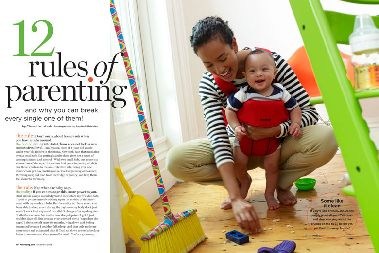
Rule of Thirds: I liked this photo because of the way they used rule of thirds. They do not have faces in the middle, rather the product that they might be trying to use.

Type Faces: They use a lot of Serif and Old Style fonts. The Serif is used in the headings while old style and sans serif is used in the body paragraphs. This is nice because it shows where they want the reader to grab attention and where they want them to read.
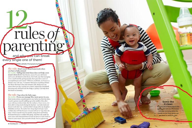
Overall, this magazine spread shows a good example of what the target audience is looking for. It has a good way of organizing while still looking fun and approachable for moms and children. I enjoy the photo they used as well as the different fonts.
